Towards Variations on a Theme: Considering 'Necessary Distraction: A Painting Show'
Francis McWhannell on Auckland Art Gallery's 'Necessary Distraction: A Painting Show'.
Painting in Aotearoa is thriving. But does Auckland Art Gallery’s new show do it justice?
Before arriving at Necessary Distraction: A Painting Show at Auckland Art Gallery Toi o Tāmaki, I am aware of two things. First, that the exhibition comprises work by artists from Aotearoa. Second, that its installation design includes sometimes unclad, sometimes unpainted walls. These, it transpires, are visible even before you enter the exhibition proper. Crossing the threshold, I come to the show’s introductory text, which I read, seeking an explanation for the walls.
It takes me several readings to begin to figure out what the text is getting at. Forgetting to mention that the artists on show are all from New Zealand, it comments that “painting appears to be flourishing”, despite the availability of other types of artistic expression, and despite “competition from the proliferation of visual media” (presumably digital imagery/video in particular). This strikes me as at once banal and dubious. Banal, because it’s fairly obvious that painting, here as elsewhere, is thriving. Dubious, because it’s not clear that the medium is now, or has ever been, under threat from other art forms or kinds of images.
Artists have never stopped making paintings. Audiences have never stopped consuming them. It’s a reality borne out by Toi o Tāmaki’s own holdings, and by the contents of dealer galleries and auction houses. My suspicion is that the ubiquity of paintings is due not only to the tenacity of tradition (the persistent association between painting and high art), and to their market-friendly nature (in that they’re one-off, saleable commodities), but also to the fact that they offer an inherently different experience to other visual media. It seems quite possible that the increasing supply of digital images is increasing the appeal of handmade alternatives.
In any case, the introduction indicates that Necessary Distraction “enquires into painting’s currency” – that is, into whether it remains a necessary form of distraction/stimulation. (It appears that the exhibition’s title is only secondarily a reference to Colin McCahon’s Necessary Protection series.) Meanwhile, the text suggests that painting today encourages “our renewed engagement with it as an art form”. Although it’s a nice notion, and one that would provide a good excuse (were one needed) for holding a major show now, I’m sceptical that painting is activating engagement in markedly new ways or to markedly new extents.
The introduction keeps pulling me up short, making comments that seem to me unhelpful to the viewer, because they state the obvious in unobvious ways, or mischaracterise the works on display and the traditions they grow out of.
But perhaps I am getting too hung up on what’s essentially a provocation – a means to get viewers to reflect on the world in which they live, and on the ways in which the paintings in this particular show might relate to that world. I want to move on, to explore the exhibition, and yet the introduction keeps pulling me up short, making comments that seem to me unhelpful to the viewer, because they state the obvious in unobvious ways, or mischaracterise the works on display and the traditions they grow out of.
The text appears to want to make much of the contemporaneity of the artists included in the show, noting, “[They] display a restless relationship with the histories of painting and culture. Their mode of address is directed to the here and now – the present continuous. While not excluding the past, … the artists in this exhibition mean to capture viewers in a flux of contemporary influence.” This all sounds rather profound, but it is, in fact, little more than a list of generalities, failing to meaningfully distinguish the artists in Necessary Distraction from their predecessors or contemporaries.
Kim Pieters, Kirstin Carlin, Emma Fitts, Stella Corkery, Necessary Distraction: A Painting Show (installation view), Auckland Art Gallery Toi o Tāmaki, 2015.
Painters, especially in the West, have long had an awkward relationship with the history of their medium, being particularly anxious to avoid lapsing into tedium by too closely repeating what has already been done. All artists address audiences of their own times. No painter could possibly hope to exclude the past – especially today, when the landscape of painting has been extensively explored. I’m not entirely sure what a “flux of contemporary influence” might be in the context of painting, but, again, painters have been attempting to eschew stagnancy and datedness for a while now.
Comments that the artists in the show do not rely on “narrative modes”, and that their works are “marked by suggestion and a seeming lack of resolution” sound more precise, but turn out to be fairly meaningless when one actually starts examining Necessary Distraction. If these qualities unite the paintings of Nick Austin, James Cousins, and Nicola Farquhar, they equally unite those of, say, Tony Fomison, Ralph Hotere, and Allen Maddox. At the same time, Austin is no less reliant on narrative modes than Fomison, Cousins is no more suggestive a painter than Hotere, and Farquhar looks positively polished next to Maddox.
Suffice it to say, it quickly becomes apparent that the works on show do nothing very unusual, let alone develop a new painting for the “epoch of information saturation”. Which invites the question: why bother to give the impression that they do? Is it necessary for contemporary paintings to be anything more than paintings made in the present moment? Surely, one of the delights of this moment is that in painting (as in art more broadly) anything goes, that newness and now-ness have never been less important.
It quickly becomes apparent that the works on show do nothing very unusual, let alone develop a new painting for the “epoch of information saturation”. Which invites the question: why bother to give the impression that they do?
The ultimate irony is that when the introduction to Necessary Distraction makes a suggestion like, “You might argue that [permanent distraction] requires from each of these contemporary artists a stronger insistence on creating methodologies that can transform distraction into engagement”, it not only fails to offer an interesting lens through which to view the paintings on display, it also risks switching off viewers who have already chosen a painting show over the screen.
*
But what of the walls? The introductory text indicates that these are meant to echo the qualities of suggestion and unresolvedness that supposedly characterise the works included in the exhibition. It’s a curious conceit. On the one hand, the stopped – and immaculately sanded – plasterboard is undoubtedly visually appealing. (I’m sure more than a few renovators have considered leaving their new walls unpainted, because they look good as is.) On the other hand, it’s visually noisy and drab, so it inevitably ends up detracting from some smaller and subtler pieces (e.g. Patrick Lundberg, Kim Pieters).
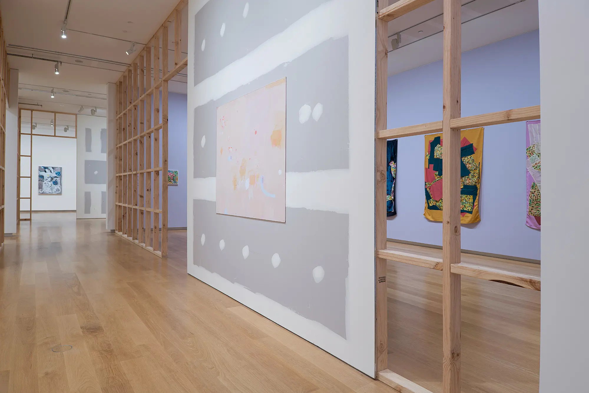
Then, too, it seems odd to risk suggesting that the works in Necessary Distraction are, like some of the walls they sit on, unfinished. I wonder how the artists feel about the idea. Anyhow, save perhaps for Lundberg, whose work is situated in a rather awkward thoroughfare space, I doubt that many of them are disappointed with the presence they’re afforded. All but two of the 20 artists in the show are given their own environments (Kirstin Carlin shares a gorgeous, lavender-walled space with Emma Fitts, whose work relates to Carlin’s) – separated from, but also in conversation with, those adjacent.
Each artist enjoys a decent selection of work, typically between four and eight pieces. (Lundberg and Simon Ingram each have a single, large work. Jeena Shin – whose painting will be familiar to those who have lately visited the Herald Theatre or the bar/restaurant Peach Pit – has a somewhat awkward combination of an exquisitely subtle, crystalline mural and a pair of imposing, and less successful, canvases.) The works tend to be from the same series or in a similar mode.
Jeena Shin, Necessary Distraction: A Painting Show (installation view), Auckland Art Gallery Toi o Tāmaki, 2015.
Necessary Distraction thus begins to feel less like a group painting show than like a series of small individual painting shows, each extracted from a high-end dealer gallery. This is not accidental. There are borrowed suites (e.g. Barbara Tuck), as well as commissioned ones (e.g. Anoushka Akel). Nor is it an ill-conceived approach. It immediately helps to make a fairly large exhibition manageable. But it also begins to feel formulaic, and to make some of the artists look rather limited in range.
Necessary Distraction thus begins to feel less like a group painting show than like a series of small individual painting shows, each extracted from a high-end dealer gallery.
Andrew Barber, for instance, would have been better served (pardon the pun) by fewer Tennis paintings. Two or three examples would have sufficed to represent the series. The current selection ends up making his work seem more two-dimensional (again, pardon) than it really is. Similarly, I would have liked to have seen the bold recent paintings of Saskia Leek offset by a couple of her more delicately coloured works of the recent past. Leek’s practice has changed considerably over the past few years, and it would have been good for Necessary Distraction to show something of her evolution.
Saskia Leek, Necessary Distraction: A Painting Show (installation view), Auckland Art Gallery Toi o Tāmaki, 2015.
Although the exhibition itself is easy to navigate, it can be tricky to match captions to the paintings on show. (One Stella Corkery piece might, in fact, be uncaptioned.) The labels are clustered in corners, presumably so they will not interfere with the display. The idea is fine in principle, but it becomes bothersome in practice. When confronted with, say, half a dozen tennis courts that look much like one another, the titles become quite a big part of the experience. It’s a nuisance to have to jog back across the room to find out that one is humorously subtitled JAY-Z BLUE! The risk: people won’t bother, and they’ll miss out.
When I can bring myself to read the show’s wall texts, I discover that these, like me, often want a wider range of work than is on display. The piece on Austin, for instance, suggests that his art reminds us of “the ordinary objects of our daily lives”, “the fabric of domestic life”, “[things] reminiscent of the props or backgrounds of some film set, used to situate people in a room”. It’s talking about works we never see, for those included are limited to a series of images of envelopes hitchhiking in various landscapes and weather conditions. (The works are at once whimsical and slightly sad, recalling both the road code and books of hours.)
In the wall texts, opportunities are often missed to give the viewer valuable pieces of information about the works on show. It is noted, for example, that Barber’s “later works have occasionally been moved back to a ‘portrait’ format, and in being so orientated their form adopts the characteristics of traditional masks”. True enough, but it would have been more useful to mention that his monumental Portrait: La Demoiselle (2015) is probably a reference to/send-up of Picasso’s similarly titled and large Les Demoiselles d’Avignon (1907), a work sometimes celebrated, sometimes slammed for borrowing from African masks.
Andrew Barber, Necessary Distraction: A Painting Show (installation view), Auckland Art Gallery Toi o Tāmaki, 2015.
The texts are not altogether unhelpful. They frequently include interesting descriptions of the works on display and the processes employed by their makers. The writing is marked by suggestion, by poetic language. Occasionally, one strikes a gem of an expression. The piece on Cousins, for instance, explains that he starts with a botanical motif, before using a stencil “to shred the image, and its nostalgic glow”. It’s a neat encapsulation of the visual effect of the overpainting, and its interference with the romantic, retro quality of the underlying imagery (even if further exploration of the significance of the imagery and its shredding is lacking).
Often, however, lyricism comes at the expense of clarity. The text on Cousins goes on to note, “Through this rupture a muddled ground emerges into view and with it a field of gesture. Locating where the hand and the image sit within this maze of signs is a challenge, used as we are to absorbing the total statement of any representation.” The primary point being made – that the pictorial elements are hard to make sense of, because we’re not accustomed to dealing with fragmented, multilayered images – is relatively straightforward, but the writing is not. It overcomplicates itself unnecessarily, losing coherence.
As I come to the end of Necessary Distraction, I can’t help but feel as though the show as a whole suffers from a similar problem. Despite many good works, it feels overburdened by disparate curatorial ideas that never really coalesce. The conceit of the walls-in-progress becomes, for me, a reflection of a lack of resolution in the exhibition, rather than in the works that comprise it. (Admittedly, a few of the artists included, among them Corkery, Akel, and Milli Jannides, go in for loose or spontaneous execution, and their paintings can feel more – to borrow a term from Raphael Rubinstein – “provisional”. However, they’re not in the majority.)
It’s not that an exhibition requires a central concept. It doesn’t. But if it is to have one, it’s preferable for this to be clear and coherent.
It’s not that an exhibition requires a central concept. It doesn’t. But if it is to have one, it’s preferable for this to be clear and coherent. Necessary Distraction might easily have been a show of new formalism, or painters under 40, or paintings by women – all solid concepts that the exhibition already gestures in the direction of. Instead, the audience gets a series of flabby notions of contemporaneity, suggestion, and permanent distraction. These feel like afterthoughts, meant to justify a selection made by some other means. Exiting the show, I find myself wondering what that means was, and whether there is a point I have missed.
*
Back home, I seek enlightenment in that great distractor, Google, and come across a press release for the exhibition. In it, Natasha Conland, the show’s curator (she apparently had some input from Abby Cunnane, Ben Curnow, Allan Smith, and Zara Stanhope), is quoted at length. Much of what she says repeats the idea that the paintings on display are doing exceptional things to stay relevant in the age of distraction. Conland notes, “They do so by moving away from traditional painting styles, such as abstraction, surrealism or impressionism. They skip between stylistic traditions and encourage us to stop and engage in the present moment.”
This piques my interest for several reasons. First, because it’s true. A good number of the artists in Necessary Distraction riff on earlier styles without replicating them. Carlin, for instance, plays with impressionist/expressionist modes, Oliver Perkins with minimalism and colour field painting, Ngataiharuru Taepa with kōwhaiwhai (and Gordon Walters), Dan Arps with Bram Bogart, Jannides with Frances Hodgkins, etc. Second, because it’s only partly true. If the works on show are not always purely non-objective, most of them rely fairly heavily on abstraction. Third, because it seems to me to glide over some greater truths.
Ngatai Taepa, Necessary Distraction: A Painting Show (installation view), Auckland Art Gallery Toi o Tāmaki, 2015.
Mode-mixing is far from a recent development in painting. It’s a fairly standard solution to the problem of avoiding staleness. Nor is it a new phenomenon in New Zealand. Many, if not most, of our best-known painters may be understood to have borrowed from principled isms (like surrealism) or more art historical styles (like impressionism) without embracing them wholly or slipping into slavish imitation. (Consider, again, Fomison, Hotere, and Maddox, but also McCahon, Rita Angus, and Julian Dashper. One could go on.)
I read an interview with Conland, in which she indicates that she thinks the general public will be surprised by the painting in Necessary Distraction. She imagines a visitor saying, “Hey, this isn’t what I was expecting.” I suspect she underestimates the average visitor’s familiarity with the general trends in art last century. It’s true that a few of the works included are surprising, because they do not immediately appear to be paintings (more on these later). Otherwise, however, there is little that might be considered unexpected.
Of course, this doesn’t matter. Some of the most interesting works in Necessary Distraction are some of the least surprising. Pieters’s paintings, for example, though unremarkable in mode, format, and scale (like most of the works on display, they are non-figurative, rectangular, and moderate in size), are deeply affecting. I am similarly delighted by Carlin’s pieces (about which, happily, the wall text is especially lucid), which are possibly the most traditional paintings in the show, in terms of both their making, and their avowed engagement with historical works in the collection of Auckland Art Gallery.
Turning to the Gallery website, I discover another rationale for Necessary Distraction. The exhibition blurb notes, “Responding to the question ‘What can painting offer that other art forms cannot?’, the artworks selected and commissioned for this survey share a focus on material and form …” This framing initially looks promising, but it tends to imply that the works on show treat painting as a well-defined, discrete medium, and that they are united in playing up the qualities conventionally associated with it. Neither turns out to be the case.
Julian Hooper, Necessary Distraction: A Painting Show (installation view), Auckland Art Gallery Toi o Tāmaki, 2015.
It is true that a good number of the artists included luxuriate in the diverse properties of painting’s central material: paint. Again, Pieters and Carlin stand out – the former creating delicate films of pigment that almost appear breathed on to the supports, the latter glossy impastos that look good enough to eat. Julian Hooper and Adrienne Vaughan are other clear examples. Although I generally find their works less successful, their enthusiasm for paint effects – such as layering, blending, and incising – could hardly be more apparent.
Other works included, however, do not give particular prominence to painting the medium. Austin’s are the most obvious examples. I do not wish to suggest that they are devoid of material/formal interest, but material and form are not their focus. Given the supposed emphasis on painting’s unique qualities, one might expect to see instead an artist with a more strongly paint-based practice – someone like Imogen Taylor, whose works are veritable essays on the medium’s expressive potential, combining bold colouration and application with playful use of supports.
Several of the artists included demonstrate an acute interest in substrates. Perkins, for instance, creates meticulously shaped canvases (I’m reminded rather of those of Enrico Castellani), to which he applies matt blocks of colour. Most of Barber’s smaller works are painted on denim. His Portrait: La Demoiselle is in brilliant Flashe vinyl on a matrix of sewn linen. Situated in the middle of his display area, the work challenges the notion that painting is a contained art form, different to and separate from others. It blends the properties typical of painting with those of sculpture, interfering in the space, and inviting inspection in the round.
Lundberg and Arps go further in combining painting and spatial/sculptural practices. Lundberg places neat, glowing strokes of paint on engorged pinheads, which he arranges in a site-specific constellation. Arps paints on cast supports that often suggest exaggerated paint daubs. (It’s unclear whether Arps is mocking painting, celebrating it, or both. Certainly, his pieces are some of the most intriguing in the show. They’re also some of the only works to explicitly refer to the contemporary moment. I’m especially keen on Post-Internet (2015), which calls to mind Austin’s witty Aquarium paintings, as well as the art of Simon Denny.)
Dan Arps, Necessary Distraction: A Painting Show (installation view), Auckland Art Gallery Toi o Tāmaki, 2015.
While the works by Lundberg and Arps retain noteworthy painted elements, those by Fitts and Taepa dispense wholly or largely with paint as a material, retaining other connections to painting. Fitts’s banners incorporate fabrics printed with Carlin’s painted images, while Taepa’s remarkable jigsaw works draw on Māori painting and carving traditions without depending on brush or chisel. The artists do not so much ask what makes painting unique as what might constitute (a) painting. They suggest that – in what Rosalind Krauss has termed “the age of the post-medium condition” – painting is less about materials than sensibility.
Ultimately, I’m left with the impression that Necessary Distraction doesn’t really know what it’s about.
Ultimately, I’m left with the impression that Necessary Distraction doesn’t really know what it’s about. Does it, then, function as a survey, as a representative sampling of current practice? Not really. There is a marked lack of more overtly figurative work. Austin’s paintings are exceptions, and there are passages of representation in various other works on display (e.g. Carlin, Leek, Jannides, Cousins). However, as previously indicated, the exhibition shows a preference for abstraction, which preference begins to look unjustified, even if one accepts the blurb’s suggestion (I don’t) that “narrative painting” is constraining.
Many contemporary Aotearoa artists who paint play with representational modes to great effect, and their work would have enhanced the exhibition. Kushana Bush and John Ward Knox – neither of whom is really a narrative painter – immediately come to mind, but they are by no means lonely examples. The inclusion of either might also have helped to broaden the range of painting types on show, since Bush tends to work in gouache, which is essentially absent (a few of the Barbers incorporate it subtly), and Ward Knox has, until recently, employed an unusual method, painting on translucent fabrics with a more or less dry brush.
I’m disappointed by the dearth of watercolour, which remains popular with a number of notable New Zealand painters. The gap might easily have been filled by, say, Michael Harrison, who makes dreamily figurative work, or Amber Wilson, who produces exquisitely precise abstractions. The exhibition is altogether less “diverse” than the website blurb suggests, less diverse than one might have hoped. (It is worth noting that the show is not especially culturally diverse. Artists of European descent dominate. Women, however, are pleasingly well represented.)
Although it is indicated that the work in Necessary Distraction demonstrates “a new vigour”, some of it, in fact, strikes me as rather tired. I’m thinking especially of Ingram’s Random Walk Exercise (2015), which does little to advance on his earlier machine-made paintings, showcased so widely last decade in exhibitions such as Conland’s 2006–7 Just Painting (which, by the by, also included Hooper; all curators have their favourites), Tina Barton’s Four Times Painting (2007), Justin Paton’s The Secret Life of Paint (2007), and Leonhard Emmerling’s PX: A purposeless production / A necessary praxis (2007).
I detect in Necessary Distraction echoes of both Emmerling’s show and its sequel, PX: Snow falls on mountains without wind (2007), curated by Jan Bryant. Five of the artists in the present exhibition were also included in the PX pair, Ingram being joined by Leek, Lundberg, Tuck, and Cousins. This fact alone is unsurprising. Good artists are bound to appear in multiple shows (a case in point: Necessary Distraction also shares five painters with the excellent 2015 group exhibition Porous Moonlight, curated by Taylor.)
I am, however, surprised to note that five of the works by Tuck derive from the same series featured in Bryant’s show eight years ago (the sixth work isn’t especially recent either, being from 2010). Here, I’m torn. On the one hand, I enjoy the quotation, not least because it chimes with my belief that a measure of continuity is inevitable in art- and exhibition-making. On the other hand, it does little to lessen my growing sense that Necessary Distraction is more concerned with conforming to existing notions of good taste than with presenting a compelling picture of current practice, that it’s a bit unimaginative, a bit safe.
Stella Corkery, Necessary Distraction: A Painting Show (installation view), Auckland Art Gallery Toi o Tāmaki, 2015.
Necessary Distraction doesn’t seem to want to be safe. It eschews the really big names in local painting (e.g. Judy Millar, Shane Cotton), and it is certainly slanted towards younger artists than it might be (all but seven of those included were born in the 1970s; Jannides and Lundberg were born in the 1980s). However, while the blurb indicates that the show features “established and emerging painters”, few really qualify as the latter, and I can’t help but think it would have been nice to see work by some lesser-known artists under 30 (e.g. Ayesha Green, Claudia Jowitt?), especially since the show involved a good number of commissions.
Perhaps, though, it’s too much to ask a public art institution to stick its neck out too far or on too many fronts. You might argue that it took guts for the Gallery to leave some of its walls incomplete. I suppose I just wish that the exhibition had taken slightly different risks – daring, in its discussion of itself, to drop the audience-alienating airs that are still too often associated with shows of contemporary art, and to be more explicit about its intentions and limitations. Imagine if the show had stated up front, “With so much painting going on, we figured we were overdue a painting show. Here’s our idea of what’s hot right now.”
My ultimate concern is that for all its desires to be innovative and engaging, and for all the good work that it undoubtedly includes, relatively little about Necessary Distraction invites the viewer to linger in its space. With few exceptions, the exhibition shies away from putting stuff on its walls – written or painted – that might make you chuckle, titillate you, move you to swear under your breath, gross you out, or invite you to reflect on the big things, whether love, death, spirituality, politics, or the end of the world as we know it. It’s a show that makes painting look rather hung up on itself.
It’s a show that makes painting look rather hung up on itself.
But maybe that’s what the introduction is secretly driving at. Maybe other forms of art have got the other stuff covered. Maybe the Internet does. I’m not so sure. I find myself taking solace in the indefinite article in the exhibition’s subtitle. It’s a subtle reminder that this is just one painting show among others. I only hope that the next one mounted at Toi o Tāmaki will present a slightly more compelling picture of what I tend to think of as a stubbornly powerful medium. This exhibition puts me in mind of an elaborately boxed sampler, which boasts fine ingredients, but turns out to be mostly white chocolate.
Necessary Distraction: A Painting Show
Auckland Art Gallery Toi o Tāmaki
28 November 2015 to 28 March 2016
Free admission