Identity Within Variety
In which I just meant to put up some sweet pieces of design, but the idea behind them got me thinking. Last year, designer Logan Walters, in what he attributes to matrilineal OCD, decided to design new covers for the original, golden run of Wu-Tang albums and side projects (1993 - circa 1999). The records these performers released during this project are almost singularly excellent - but they’re a visual mixed bag. The Wu operated as a collective, but were heavily individualistic in other ways - often, their covers were distinct and garish statements of intent. This made for fitting visuals - the comic book art of GZA’s Liquid Swords - or decade-dated eyewaterers (Ghostface Killah’s Iron Man). Quoth Walters: “I need to have decent-quality album art for every album on my computer, which currently equals over 90 gigs.”
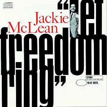
He took his cue from the golden age of venerated jazz imprint Blue Note Records. In 1956, Blue Note hired magazine artist/designer Reid Miles, who gave their label’s releases an oft-imitated and very cohesive look. Miles traded in framed bands of colour, sharp delineations of image and type, tinted monochrome, and a dynamic use of space. That he did so on some of the most acclaimed records of his time was a happy confluence - and now it’s hard to separate out the visual from the auditory.
But then: tension alert! - it’s also derivative, right? The Wu’s members know what they wanted on their album covers, and if they wanted lovingly crafted Blue Note homages to tie themselves all in together then they would have made the call. Would they even want their solo efforts to be bound to each other that strongly? The unified golden age of Wu-Tang related records is a critic’s taxonomy - it’s not the artists. But I made this the album art on my computer anyway, and - hell, maybe a little OCD wagging in my own left index finger ceased its shimmy in my sleep, knowing all these great records were finally gathered under a handsome umbrella.
Critics. Crit. Criterion Collection. Some good films in there. Really sexy covers, sometimes. Probably more than anything, it’s a project that’s allowed for a reification of design around commercial work. Film posters used to be very upfront about their mission to get people into the cinema by offering up as many of their wares and plaudits as possible. I’m looking at this poster on my wall right now, and I still find it utterly hilarious - a ridiculous mis en scene of every possible element of the movie that looks like The French Connection on its bottom left, a pro-wrestling movie on the opposite right, and an episode of Hee-Haw at the top. Quite literally something for everyone. The studio would have been hedging their bets on the bored husband and the senile, nostalgic grandparent alike.
If Criterion puts out The Magic Of Lassie tomorrow, it will have an artfully taken shot of a solitary dog tag on its cover. A lot of people will probably just assume it’s Full Metal Jacket or something. Ooh, that’ll be good. But the director of The Magic Of Lassie will be happy, because the studio suits took over the aesthetic of his movie at some point and bastardised it by commissioning that cravenly populist poster. He really wanted a solitary dog tag all along. Or something.
A little akin to the awesome pics Rosabel put up last week, Criterion fever has spread to other things, including video games, a form of creative endeavour that’s always been a bit hard done by by its packaging and presentation. And it’s fun, but it’s also an attempt to re-affirm a critical hegemony under one livery - and really, that’s a worry right? Perhaps I’m more blase about films, but I’d be mighty irate if, like, Pitchfork started some sort of ‘retro’ super-label of physical re-releases of the records it judged to be ‘important’. Hot design or not.
And the Criterion thing is a bit weird because:
1. Won’t you run out of good films at some point? To be pernickety, should you include every film from a great director, or his most important and representative? Is being a completist compatible with creating a sort of ‘distinction brand’? For example, the Punch is always going to rep hard for Woody Allen, but we know he’s hit and miss - some of his films should never, ever be in any collection apart from the kind that goes out on Wednesdays for the rubbish truck.
2. I think Vigil, The Quiet Earth and Sleeping Dogs should be in an aesthetically appealing repackage of the ‘best films of all time’, no question. But they won’t because that’s just me being parochial, and that’s also Criterion being this weird mix of parochial, hip, and commercially conscious. And once you’re establishing this towering catalogue of consumer fetishism, where does my tatty VHS of Vigil fit in?
3. The Criterion Collection put out Michael Bay’s Armageddon as its 40th release, ahead of such lesser efforts as Ali (Fear Eats The Soul) and Brazil. WTF. Could any collector be this OCD?
And suddenly, i’m aware that it’s all a little bit too corpulently serious - whether you’re deigning to give a hip-hop album a ‘proper’ sort of cover or trying to distill a disparate, messy, human world of cinema into numbered, Photoshopped cases for flimsy silver discs.
So obviously I’d look a bit hypocritical if I went from complaining about seriousness to talking about Joy Division’s label to end this ramble, right? Well, nah - cos Manchester’s Factory Records is one of the funniest subversions of collector’s mystique ever. From 1979, their numbered, limited editions interspersed what became seminal albums with posters, badges, a record released in a sandpaper sleeve to gradually destroy anything it was shelved with, a t-shirt, a blueprint for a ‘menstrual egg timer’, a cancelled event, a nightclub, a cat, and a lawsuit. It’s a handy deflation that reminds us that our natural feelings for something never evolve too far beyond the love you feel for your first stuffed toy, one eye gone, holes seeping with stuffing, collectible to no one. Ultimately, you like what you like, and what you like is what it is.
Factory Records #61. Gotta catch ‘em all.