The Gorgeous Nothings: An Interview with Nick Austin
Megan Dunn talks to the artist about mag po, Emily Dickinson and the “Forgotten Prince Charles Soap”.
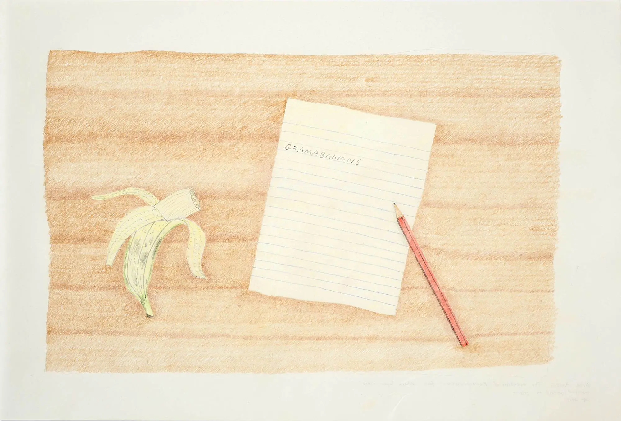
He was a nail biter in his youth. In adulthood, a painter of envelopes, and fridge notes, of boxes and concrete poetry. Austin likes to play word games and his elusive art has been said to borrow from the logic of ideograms, crosswords, puns, jokes and concrete poetry.[1] The Invention of Banagrams (2015) is a picture drawn in coloured pencil on paper of a writing pad and an HB pencil at rest. The handwriting on the pad reads: GRAMABANANS. Nearby is a partially peeled banana, its yellow nib missing. Austin’s work flirts with literalism, insisting everything is and isn’t what it seems. His acrylic paintings are rendered in a deceptively guileless manner evocative of the candid illustrations in certain children’s picture books. He also sculpts: Unfinished Couch (2017) is a life-size pink two-seater made out of polystyrene and papier-mâché. The left arm of the couch has been left incomplete, as though waiting to be “coloured in” and thus fully imagined. Empty couches recur in Austin’s paintings as spaces to travel and dream.
Personal Addressis a new book that includes an exchange of letters between the artist and critic, Wystan Curnow. And it is the best kind of book, a picture book, which contains Austin’s recent work and his Travelling Envelope paintings. This epistolary volume, with its charming occasional P.S’s, gives shape to Austin’s concerns and is matched by Curnow’s intellectual capriciousness. In one letter Austin writes, “I’m the product of a de-skilled art-school education but I’ve tried to turn my technical shortcomings into something fruitful; I have a fruitfully foreign relationship to painting.”
Austin has a Bachelor of Visual Arts from Auckland University of Technology and a Masters in Fine Arts from the Elam School of Fine Arts. He was one of the members of the influential Auckland artist run space Gambia Castle. In 2012 he was awarded the Frances Hodgkins Fellow at the University of Otago and he has lived in Dunedin ever since, with his partner the painter, Saskia Leek and their daughter Agatha.
Megan Dunn talks to the artist about mag po, Emily Dickinson and the “Forgotten Prince Charles Soap”.
Magnetic Poetry (detail), 2016, acrylic on canvas, diptych, 150 x 55cm overall. Courtesy of Peter McLeavey Gallery. Photo by Shaun Matthews
Megan Dunn: I was just typing a rather long-winded email to you that I have stupidly erased, it as though I have fallen prey to your ‘fridge note’, The Adventures of an Eraser.
In PTA newsletter at Peter McLeavey gallery last year you presented Magnetic Poetry (2016), two silver canvas panels hung together as though they might be a fridge/freezer, with a sprinkling of paper notes on the door. The fridge is often a site for errant creativity. We put our kids art on fridge, I still own magnetic poetry that I shuffled around once then never wrote with again.
Nick Austin: The novelty of mag po was only ever brief, wasn’t it? Its contradiction was how it became frozen on the door in spite of what defined it. On more fridges than not, now, it’s more an artifact than a living game.
Materially, I never liked mag po – it didn’t feel nice peeling off annoyingly tiny bits with sharp corners, especially as a nail biter. No, I preferred to sit down with a game of Scrabble, fiddling with pleasantly smooth tiles, even the plastic ones, and piecing together bump-able words on the board, letter by letter. The texture of language was much more interesting, fragile, that way.
(I vaguely associate mag po with my shift from Northland to Auckland in 1990, when I was 10. We first had a set of words on our fridge, in Devonport. The game’s urbanity tied in with an upswing in my family’s socioeconomic fortunes. )
I like it how the fridge door is a democratic place where a cross section of life’s paper trail gathers. It’s the venue for an un-self-conscious, enjoyable version of a family-focused public programme activity at a public art gallery; fridges can be casual, private exhibition spaces. And I think that by making a painting of ditties on a fridge and exhibiting it in a proper art gallery, well, I was trying to bring some of these qualities I mention into relief.
Magnetic Poetry (detail), 2016, acrylic on canvas, diptych, 150 x 55cm overall. Courtesy of Peter McLeavey Gallery. Photo by Shaun Matthews
MD: One of the notes on the fridge read “Happy Birthday” to a list of historical VIPs: Carlos Santa, Edmund Hillary, Judy Chicago, Petrarch (had to Google him, Italian scholar, may have invented the Renaissance), George II. It was funny to match the informal happy birthday song to such adult candidates, funnier still to try and conjure an image of little Judy at the dinner table, blowing out her candles, “make a wish!”; did Edmund Junior get a cake in the shape of a mountain? Carlos: a guitar? Human beings make a diverse shopping list.
NA: You just gave me an idea, Megan.
MD: What is the relationship between childhood and adulthood in your work?
NA: I read this question to my daughter and she said, “Questions.” I like this answer because it represents sense and nonsense at the same time. Children ask so many bloody questions and to answer them becomes a special job – to verbalise what you simply know. (This time, though, she answered my question – and “questions” became an answer J ) As a parent I sometimes catch myself asking the same sort of questions. I asked a barman yesterday how many times he’d washed his shirt to get it that shade of black. I hope he simply thought I was drunk.
What I remember about childhood is the constant intermingling of longing and idleness: A longing for Corfu (I was never as interested in animals as that Island in Gerald Durrell’s books) mixed with idleness when faced with a piano (though never when playing Satie’s Nine Children’s Pieces). This has continued into adulthood: a longing for the work of Giorgio Morandi mixed with idleness when confronted with a dripping tap. As an artist though, you get to ruminate on the dripping tap instead of fix it.
I used to identify as a lazy artist – now I’m a tired artist.
MD: We share some of the same loves: Judith Kerr’s Mog illustrations, Russell Hoban’s children’s books (in your case specifically the Frances books). And you conceived of your solo show for Laurel Doody in Los Angeles as a children’s book. The show called Where Sugar Lives featured a work of the same title which is a coloured pencil picture on paper of a coke bottle, a tiny woodland cottage just visible inside the glass. A nearby drawing of a mandarin (for a sensitive child?) has a green Hobbit door. Both illustrations were in fact one work, pragmatically arranged on the same clipboard. Early childhood seems to be all about nouns – things are what they are, but sometimes they are also what they seem.
NA: I’ve just been looking at some Frances books by Russell and Lillian Hoban, which I’ve not seen in over thirty years. They really capture, for example, the fleeting jealousy, of another sibling’s birthday. The coloured pencil drawings are so soft, ethereal and the family of badgers so furry. I find their facial expressions so warm and tender. Pictorially – artistically - these books are satisfyingly economical, graspable, contained – the world exists in a room. In a book, even. Margaret Wise Brown’s Goodnight Moon is the same. Predictability of things, environments, relationships – the comfort one gains from this – well, it’s all a very resonant foundation – for life of course, but also for the Laurel Doody drawings.
MD: How has fatherhood changed your art life?
NA: It has given a dimension of practicality to how I was working anyway – in little bits because time’s pockets are smaller now. I used to identify as a lazy artist – now I’m a tired artist. What I mean is, I always felt less than ‘workmanlike’ in terms of studio production, a bit ‘part-time’, but couldn’t quite make that a subject of the work – consequently the practice felt a bit fraudulent. Tiredness is somehow a more emotionally truthful subject for me. And so fatherhood is a natural ingredient for the work to use. (I couldn’t have developed an admiration for the parent paintings of Michael Smither if not for being a dad myself.)
Paleo Apartments (detail), 2017, Hopkinson Mossman.
MD: Your last two exhibitions PTA Newsletter (2016) at Peter McLeavey and Paleo Apartments (2017) at Hopkinson Mossman feature dietary components, including a bottle of milk ‘camouflaged’ inside a Friesian cow print abstraction. And the Paleo Apartments works appear as high-rise canvases (floor plans?) lofty with good ingredients: courgette, fennel, broccoli, water (written in blue), quince paste (crossed out.) How did these works come about?
NA: Yes, the Dietary Apartments are meant as elevation drawings of apartment buildings but they also double as to-scale, open-door fridge schematics. Each Apartment was titled after a contemporary, faddish diet – Paleo, FODMAPs, Raw Food and so on. In pencil-drawn shelves/rooms, I wrote the names of foods that were appropriate (or crossed out if they were inappropriate) to each diet in marker pen the same colour as the food itself.
Apartments and diets – I liked rhyming the framework of a diet with the literal structure of a building. In this exhibition – the Fridge dwellings were one half of it – I liked the absurdity of comparing problems of housing with problems of the gut, domestic interiors with body interiors. I conceived of these very much as Auckland works – to be shown in Auckland. Portraying the housing crisis as a problem for yuppies, too – well, it wouldn’t really have made sense in Dunedin.
MD: So Paleo Apartments is a critique on Auckland? What dietary work would befit Dunedin?
NA: A satire, I would say. Regarding Dunedin, um, I will have to marinate on that.... What I think would befit Dunedin, though, is some good graffiti, critical of the landscape in which cynical, quick-buck architecture is sprouting up right behind the highly branded ‘Heritage’ quarter within which Street Art is used to pat everyone on the back! Hopefully this graffiti is out there already and I just haven’t seen it.
TJ Macnamara once described some of my work as dull paintings of a dull world. Maybe he was right.
MD: For me your work offers a rebuff or respite from the professionalism of our post-industrial lives where people are reduced to CVs, paper pushers, addressers of envelopes and now emails. What worldview - social, moral, economic - do your works conjure and/or critique?
NA: TJ Macnamara once described some of my work as dull paintings of a dull world. Maybe he was right. At the risk of being parochial, I think my work represents a kind of fatigue with the speed of everything, with how quickly 'givens' are formed. At some point the practice became concerned with its own sustainability (financial but also in terms of ideas) - how can I keep this going?. The work's somewhat economical means - material, pictorial - well, they're connected to this concern. The relationship between How do you make a living as an artist? (or maybe just How do you live?) and How do you make art? is a close one.
MD: Can you – will you – indulge my biographical fantasy? I imagine that you were an only child raised by wearers of corduroy, in a house stepped in books, a cat's tail whiskering past an ankle as another tome is unearthed from the shelf, dust unsettling.... How off is this cliché?
NA: I have two older brothers and my parents were civil servants. We lived in various places in Northland – Whangarei, Kaikohe, Paihia – before, as I said, coming to Auckland when I was 10. We had two cats. My parents were very permissive and told us we could be whatever we wanted, and they never appeared to pass judgment on our choices at any stage. It’s easy to say I had a very normal childhood, within a loving family, though I’m not really sure what a normal childhood is. I think I was bored often and daydreamed as much. I watched television far more than I read books. The first profession I aspired to was sports commentating; next was cooking. Is this quite disappointing, Megan?!
MD: I’m only ever truly disappointed in myself.
Let’s talk about your book. I loved Personal Address and read it in one gulp, like a great cup of tea. How much of your correspondence with Wystan Curnow was edited out?
NA: We wrote the text pretty much as it appears in the book. I kept going back to re-phrase and clarify meaning within sentences but the basic gist of it was unchanged. Of course, there was an invisible, parallel correspondence where we discussed our discussion and pointed to directions the text might take.
The Gorgeous Nothings: Emily Dickinson's Envelope-Poems by Jen Bervin, Marta Werner.
MD: Wystan is a great writer and critic. Wystan is also good name for a writer too, contains that right amount of wistfulness (I just looked up the meaning: From the Old English name Wigstan, composed of the elements wig “battle” and stan “stone”. It was the name of a 9th-century Anglo-Saxon saint.) I take it you weren't aware of Emily Dickinson’s The Gorgeous Nothings before Wystan brought it to your attention? I have only seen images of the envelopes online and they are dazzling. Do you think your work is about the gorgeous nothings?
NA: Wystan and I first met a few years ago when we were set up by a mutual friend for a studio visit. It went very awkwardly. So when Danae Mossman [of Hopkinson Mossman] suggested him as a writer for the book I was quite apprehensive. For some reason, though, he agreed to come on board for the project.
Wystan is a formidable figure of course as both a critic, and teacher, and not actually having read much poetry at all, I considered myself severely unequal to any discussion of it. Yet poetry seemed to be the obvious starting point. We found common ground with John Ashbery and Joe Brainard’s Vermont Notebook. I’m a huge fan of Brainard’s and obviously Ashbery is a major figure within modern American poetry. The complementarity in the book between one’s drawings and the other’s poems, was a good subject for our first conversation. A bit later, and knowing I wanted to document a survey of my envelope works within the book, Wystan suggested the writing could take the form of a correspondence between ourselves, and that it could begin by touching on Emily Dickinson’s The Gorgeous Nothings.
That book presents the so-far known envelope manuscripts of Dickinson, poems written on and in repurposed envelopes that Dickinson cut and flattened in a startling variety of ways. While I couldn’t honestly say I ‘understand’ much of them as verse (though I love the words’ enigma) I was very stimulated by the materiality of the works, which in the book are really presented as visual art. (They’re not dissimilar, I think, from a catalogue I once encountered of Robert Walser’s cryptic, microscopic manuscripts inscribed on scraps of cardboard.) Faithfully reproducing the envelope works as images, the book circumvents the typographer’s nearly impossible task. More generally, though, I was very intrigued that her poems were transmitted not as published, printed work but in private correspondence. As such, the content and its form are epistolary. Which is something I was trying to ‘get at’ in Personal Address, a sense of having a discrete and writerly communication with a viewer.
I’ll quote the first paragraph of the book’s introduction by Jen Bervin just to contextualise the book’s title:
“The Gorgeous Nothings is an excerpt from Emily Dickinson’s manuscript A 821. In choosing it as the title for this project, I was thinking of Dickinson’s own definition for nothing in a letter: “By homely / gifts and / hindered Words the human / heart is told of nothing – ‘Nothing’ is / the force that renovates / the World –“ and her definition for no: “the wildest / word we consign / to Language.” These ‘gorgeous nothings’ are that kind of nothing.”
I’m struck by the line “‘Nothing’ is / the force that renovates / the World.“ It suggests to me the invisible but important power of the overlooked. I see the ‘nothing’ as a function of art.
Travelling Envelope #3, 2012, acrylic on newspaper, 575 x 785mm. Private collection
MD: Wystan’s observation about your Travelling Envelopes is acute, they do all face backwards to the viewer, so we look at the triangular seal, rather than the printed address.
I love your envelopes, though curiously when they are in desert settings I feel they are far away from home, longing for Corfu perhaps? My favourite is Travelling Envelope #No. 3 (2012) – the blue car at night, its yellow headlights beaming out, that soulful black branched tree omitting just the right amount of Sylvia Plath, the mottled greyness of it all as night descends. Do you know that Janet Frame quote about how as a child she looked out down a country road and heard the wind in the telephone wires and perceived the loneliness of the world?
NA: No I didn’t but I’m glad I do now. My daughter’s school was the site of Frame’s famously brief teaching career, which I think would be an excellent subject for an Arthur St School production.
MD: Do you think of your work as an interior monologue? Your art gives me the same heady buzz as Nicholas Baker’s The Anthologist. I resisted that book for so long as I hated the cover, then read it and loved it. I enjoyed the lead character riffing on his process of avoiding composing an anthology of poetry, following his dizzy thoughts as he laid out the case for rhyming. The gorgeous nothings are really quite something. He’s a flaneur of thought, as are you.
My recent favourite object was something I also spoke to no-one about, I dubbed it the “Forgotten Prince Charles Soap.”
NA: I think you put me onto this book a few years ago? This book is very rangey, but then so is Nicholson Baker’s oeuvre. Both the author and his character in The Anthologist, Paul Chowder (love that name) pretty much do what they want, don’t they? Re-reading a bit of it just now, the part where he says “When I come across a scrap of poetry I like, I make up a tune for it” reminds me of the Netflix show Love where the male lead likes to compose songs with his friends, named after movies (“It’s either Carlito’s Way or the Carlito’s Highway!”). I love both images’ stoned wholesomeness.
An interior monologue, eh? Yes I think you might be right. Somewhere in the book Wystan talks about the relationship between the works being as important as the works themselves, which maybe is related to your observation here. Gaps, silence – these are important elements, too.
I am always trying to reconcile my vocation with my day job as a museum guide. When I’m not giving infrequent tours I like to talk to myself about unlikely connections between items on display. At the moment I’m interested in exhibits that relate to how a bird would view the city. Maybe I’m just interested in flight and its metaphorical resonance with presentations of the past.
My recent favourite object was something I also spoke to no-one about, I dubbed it the “Forgotten Prince Charles Soap.” When the Prince visited the museum last year it was such a big deal that for one day the bathrooms’ liquid soap was replaced with bars of Dove. They were removed the next day except from in one bathroom, an oversight I liked to think only I noticed. Each time I washed my hands with it I thought of the Prince going to the toilet. It’s since slowly vanished.
MD: I am just trying to imagine if I see Prince Charles as a “Dove” soap man.
Have you seen Parris Goebel's NZ Post ads? I want to like them as I appreciate she is a creative genius leveraging NZ's cultural real estate abroad, but I hate them. The experience I had of last queuing in one of their stores, reminded me much more of The Ballad of the Limping Mailman that you and Wystan refer to in Personal Address.
NA: They seem to me a choreographed apology from NZ Post.
MD: Maybe we could talk about your boxes?
Negative Production, 2015, acrylic on canvas, 1630 x 2230mm overall. Chartwell Collection
NA: At art school I was very fortunate to spend a semester abroad at Carnegie Mellon University in Pittsburgh, USA. As part of my study there I did an internship at the Andy Warhol Museum where with my pal Richard Orjis, I worked in the Archives Department. One side of the reading room was lined floor to ceiling with Warhol’s time capsules, identical cardboard boxes that Warhol would periodically fill with everything swept off his desk. Museum staff had exhumed all sorts of things from these – an uneaten cake, a big wad of money for instance. For all their weird riches what fascinated me was the capsules’ complementarily benign appearance.
Fifteen or so years later I thought I would make a painting of a box. I wanted it to have the mix of mystery with the benign I remembered about Warhol’s – the metaphysical gravitas of the object’s unknowable content/s. I wanted to paint the picture like a Morandi but it ended up looking like something from my fifth-form art boards, though I thought it was successful for this. The work used ‘cavalier perspective’ in which the back of the form on the picture plane measures the same as its front, as in real life. I like this perspective in this work as it represents an attempt to translate, or even fit, a memory of an object into a picture. Unusually for me I called the painting Untitled, which I think is good – though at its exhibition my friend mistook its title for that of the work next to it: Drugs, which I think may be even better.
Months after exhibiting Untitled, still channeling my Warhol memory, I thought I’d make a show of paintings of this same box – I thought the ambiguity of the box as a repeated thing or group of identical things, would be somehow interesting. I stumbled through making the works but the idea was too unclear in the end so I packed them all away and forgot about them.
As another attempt at box painting I made a diptych of a smaller and larger version of the box in Untitled and called it Memories. The diptych was presented in my show Time’s Sieve at Peter McLeavey’s in 2014. Memories referred to the earlier work of course, and my private memory of Warhol’s boxes too, but also to what might be inside those boxes. I wanted the different box sizes to refer to volumes of memories, to pictorialise the practicality, impracticality, of storage.
Later I unpacked my earlier, ‘failed’ box paintings and it struck me that all their technical flaws, and hesitancy of intent, may well be interesting to present as a single work. The works were shown in Touch Your Brain, a group exhibition at Hopkinson Mossman in 2015. Titled Negative Production, they crystallised for me the wrong turns and wasted energy of failed studio endeavors. In another way, the work offered the invisible contents of a cardboard box as the subject of the paintings themselves.
Why am I telling you all of this? To try and describe a process that may not be self-evident, I suppose.
MD: I like how Negative Production is arranged in a grid, three down, three across except the ninth box painting is missing or “empty.” “Nothing” is the force that renovates the work.
[1] Sarah Hopkinson, 'Nick Austin', Last Ride in a Hot Air Balloon: 4th Auckland Triennial catalogue, Auckland Art Gallery, 2010.