So You Want to Rebrand New Zealand Part II
Jono Aidney gets inside the boardroom as a group of gentlemen discuss their efforts to rebrand New Zealand, starting with their heartily successful campaign to change our flag.
Jono Aidney gets inside the boardroom as a group of ad men discuss their efforts to rebrand New Zealand, starting with the heartily successful campaign to change the flag.
*Thanks for all being here and sorry for the early meeting, gentlemen.
Pru will take your coffee orders. Help yourselves to the muffins. The small crumbly ones that taste like dust are gluten-free.
It’s been a real honour to be involved in this rebranding project. Our team has worked around the clock - especially the interns, who are sleeping in this meeting room until they can afford to pay Auckland rents.
We have four ideas to show you - all strong contenders.
But we’ve also looked at other touchpoints, too. We’ve redesigned the currency, which until now has been functional but hasn't really 'popped', as such. And because we’ve heard rumblings from our competitors about a new anthem, we also have a recommendation on that.
No designers in the room again today. But don’t worry - I’ve worked in advertising for 10 years, transforming a range of companies that are flourishing to this day. One time I even helped to rebrand Fonterra.
Pru, would you be a darling and drive the Powerpoint for us?
IDEA 1) IT’S A KORU
This koru symbolises new life, a young country slowly unfurling onto the world stage. It’s about being green - but without using the colour green or anything else that could be misconstrued. Picture a friendly pod of Maui’s Dolphins guiding a majestic foreign tanker to undiscovered oil.
No, you’re right. It does look a bit like the Rena spill. We’ll take this one away and make some tweaks. You’re 100% sure you don’t want green?
Fine. Let’s push on.
IDEA 2) THE NZ TRADE & ENTERPRISE LOGO
This one will stir a few positive memories. In 2003, it fluttered from the passenger window of every Cayenne in Ponsonby. Loyal. Remember that? Then in 2007, we slapped it on a giant rugby ball under the Eiffel Tower. Then in 2011, it was tattooed on the ankle of that comms graduate you pashed behind the Portaloos at The Winery Tour.
And, sure, that wasn’t our finest America’s Cup. Or Rugby World Cup. And to be honest, that wasn't Dobbo's best set. But I think “cursed” is pretty strong language, don’t you?
I don't think you can even put a curse on a fern.
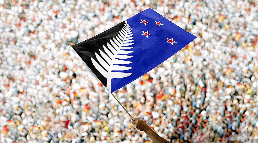
IDEA 3) SILVER FERN ON RED AND BLUE
This one just screams: ‘Welcome to the big leagues!’ A brave collision of the boring old flag and the exciting NBA logo. Good. I knew you’d like this one.
Pru, how about you duck out for those coffees now, love?
Yep, just ask Amanda at reception for some petty cash.
Now. Gentlemen.
Clearly this flag is the National Party logo on the right, blue with stars, and the Labour Party logo on the left, red with a fern. So where’s the genius in this design?
It’s perfectly proportionate to the 2014 election result. A flood of blue ascending to a cornered patch of quivering, fragmented red. Now, I hate to jump the gun on these things, but we’ve taken this design into research, and I think most New Zealanders agree that the status quo is safe with this option.
IDEA 4) SILVER FERN ON BLACK AND BLUE
But why not take it one step further?
In this version, we’ve eliminated red entirely. Pure black and blue. The All Blacks and the National Party. John and Ritchie. Conjoined twins, fused at the heart, but in a happy way. Defending the Rugby World Cup. As one.
Pure black and blue. Like a bruise after a tough match.
Now, the money. I know how excited you all get when you see money. Maybe we should have started with this part of the presentation.
Here’s what we’ve done with your bank notes.
Nice job, right?
Think of it as an evolution, not a revolution. We’ve just made the colours pop. Added more pictures of stuff, for people who like looking at things. More shiny bits, which I’m told is desirable in 'rap videos' and youth culture. You’ll notice on the $100 note, we’ve even put a little picture of money on the money to make the money more valuable.
Later in the year, we’ll be releasing a special run with a few contemporary faces: Jon Toogood on the $5 note, Graham Henry on the $10, Sam Morgan on the $20, Mike Hosking on the $50 note, Russell Crowe on the $100, and a very special $75 note with Lorde, Lydia Ko and Eleanor Catton all squeezed on.
But before we wrap up this meeting, there’s still the matter of the national anthem to discuss.
God of Nations has served us well over the years. The All Blacks do an alright job of it. Some of them have even learned the Māori version instead of just mouthing vowel sounds. But I think you’ll agree, as far as anthems go, ours is a wee bit daggy.
That’s no reflection on New Zealand. We’ve produced more than our fair share of rock and roll legends. The Finn household alone boasts more talent than all of Australia combined. And don’t even get me started on my favourite indie band, Flying Nun.
But there was one artist we just couldn’t go past.
And we did reach out to Lorde about writing the national anthem for us. It’s just that she was a bit on the expensive side. In the end. I think we found a great compromise. Haven’t we, team?
It’s a soundalike. From a music library in Australia.
And I think it’s pretty legal.